


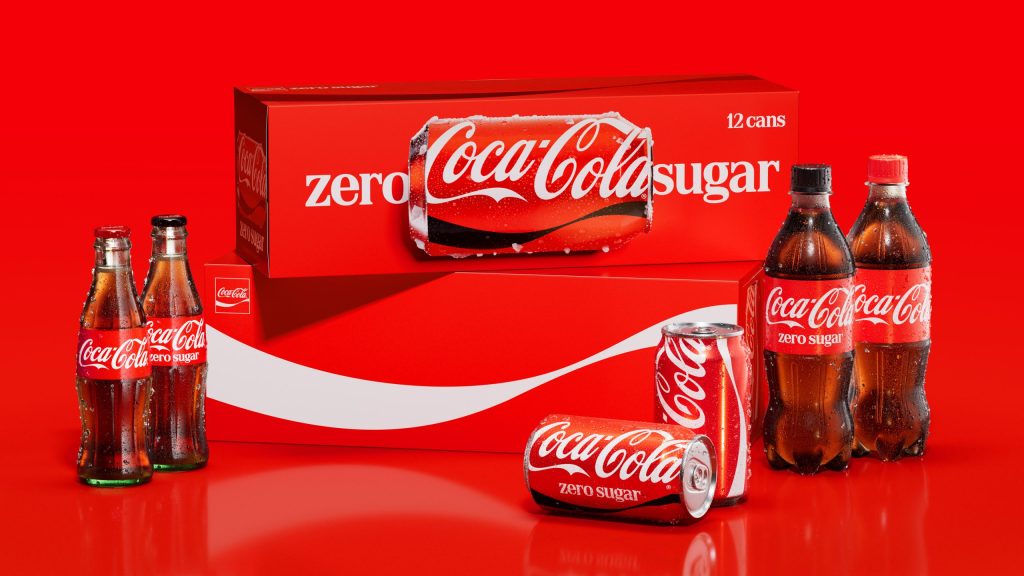
The Coca-Cola Company has rolled out a new visual identity for its flagship soft drink brand, part of an effort to give the brand a more unified appearance in the more than 200 markets where it is sold around the world.

Announced recently, the update leans into design elements the public already associates with the brand rather than starting from a blank slate. Company officials have framed the philosophy behind the project as an attempt to make the brand feel “more Coca-Cola,” not less familiar.
The rollout will touch Latin America, Europe, the Middle East and Asia first, and will show up everywhere consumers encounter the brand — on store shelves, vending machines, delivery equipment, and across digital advertising and apps. Central to the new look is a stronger visual push on things like the brand’s red-and-white colour scheme, the twisting Dynamic Ribbon graphic, the Arden Square shape, and the brand’s long-used Spencerian script lettering.

The company’s sugar-free line, Coca-Cola Zero Sugar, is being redesigned alongside the main brand. Cans will carry bigger “Zero Sugar” lettering and a black version of the Dynamic Ribbon, while PET bottles will now come with black caps to set the variant apart at a glance from regular Coca-Cola.
Behind the scenes, the company has built out a new internal resource called the Brand Center, paired with AI-assisted design tools, to help its marketing teams and outside agency partners keep the brand’s look consistent as it spreads across so many different markets and formats.
Three outside design firms worked on the project alongside The Coca-Cola Company: Jones Knowles Ritchie (JKR) led the overall identity work, The Superultrarare handled the packaging redesign, and Brody Associates developed the typography.
Arnab Roy, President of Coca-Cola Global Category, linked the refresh to the brand’s stature, noting that being one of the world’s most recognised names carries “a responsibility to keep evolving.” He said the goal was to give the brand a clearer, more consistent presence everywhere people come across it.
Rapha Abreu, the company’s Global Vice President of Design, said the new system was built to give consumers “one recognisable brand experience” no matter where in the world they encounter Coca-Cola.
Parts of the new look are already visible in selected markets in Europe, the Middle East and India. Latin America and Asia are next in line, with the company expecting the full global rollout to run through 2027.
This is the biggest overhaul of Coca-Cola’s global brand presentation since a similar consistency push in 2021.
