Google has quietly rolled out an unmissable visual overhaul of Gmail and its wider suite of Workspace productivity tools, replacing the flat, primary-colour icons that have been a fixture of digital life for nearly six years with a new design language built around soft gradients and what the company describes as an artificial-intelligence aesthetic.
The redesign, which began appearing on the web and on mobile devices on 18 May 2026, affects Gmail, Google Drive, Docs, Sheets, Slides, Calendar, Meet, Chat, Keep, Forms, and Tasks, all applications that form the backbone of professional and educational life across the African continent.
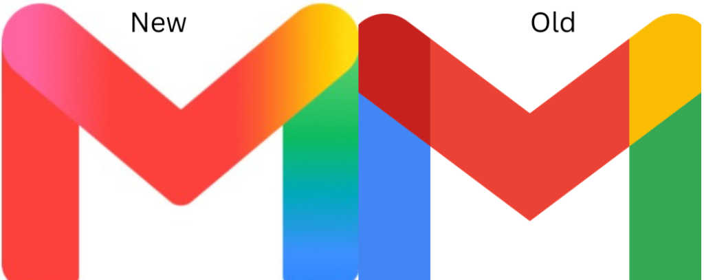
What changed?
The most recognisable element of Gmail, the envelope-shaped “M” remains intact. However, the four discrete colour blocks of red, white, yellow, and blue that defined the icon have been dissolved into fluid, blended gradients that lend the icon what design commentators have described as a glassy, almost water colour quality.
9to5Google, which first reported the full extent of the redesign in late April based on sources familiar with the matter, noted that the changes address a long-standing criticism of the previous icon set that the apps were too visually similar to one another. The new design makes each application more distinct through shape and colour differentiation.
Industry analysts and technology publications have emphasised that the redesign carries strategic weight beyond its visual impact. According to reporting by Droid-Life, Google had introduced a gradient design language for its core “G” logo approximately one year earlier, a change it explicitly linked to the integration of artificial intelligence. That language has since been applied progressively to Google Home, Photos, Maps, and Gemini and now extends to all productivity tools.
The timing of the rollout, days before Google I/O 2026, was widely interpreted as intentional. The annual developer conference, at which Gemini AI featured prominently, served as a backdrop against which the visual unification of Google’s ecosystem carried added significance. Android Central reported that the redesign represents the most substantial refresh of the Workspace icon suite in nearly six years.
As of the time of publication, several aspects of the rollout remain unresolved. It is unclear whether the redesign will extend to the favicon or how the gradient treatment will render in dark mode, where gradients can present display challenges. Google has not indicated whether users will be given an option to revert to the previous icons, and no formal announcement has accompanied the rollout.